VISUAL DESIGN
BOOKS
-
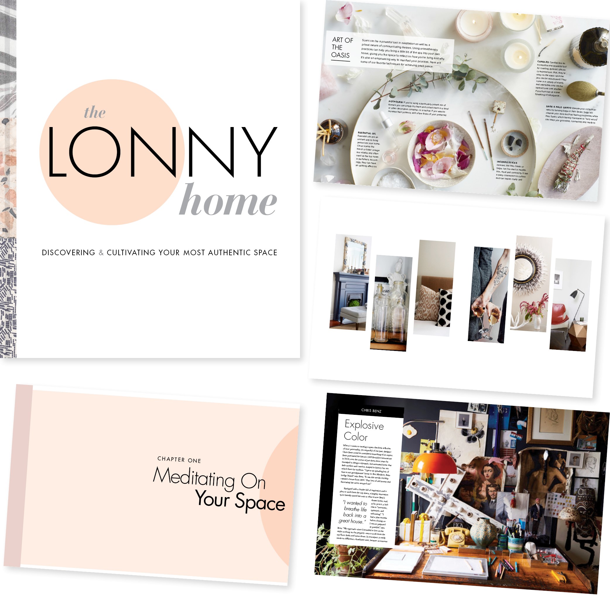
THE LONNY HOME
THE LONNY HOME
Art Director
Worked with WO team + Lonny to develop concept. Designed look-and-feel of 300-page book, including art directing a photoshoot with photographer Naomi McColloch and stylist Bryson Gill. Met with editorial team to present ideas and work on edits.
304 pgs. Nov. 2018
[ WELDON OWEN ]
-
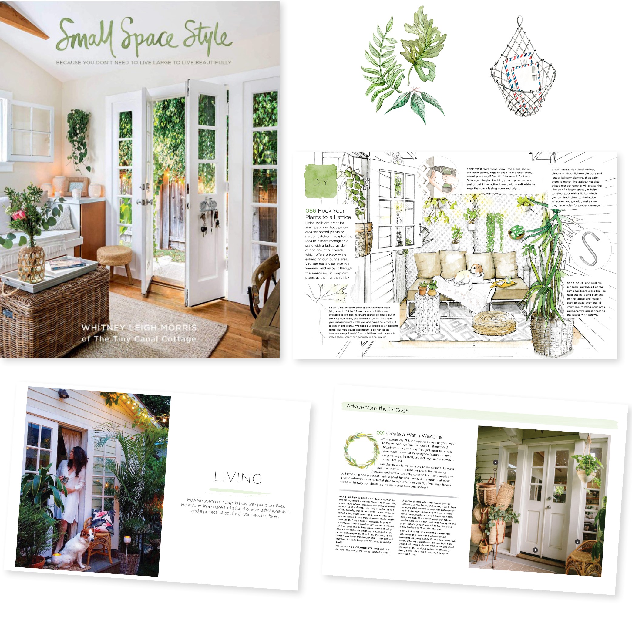
SMALL SPACE STYLE
SMALL SPACE STYLE
Art Director
Concepted look and design, from cover-to-cover, including art directing illustration. Researched and sourced photographs to illlustrate book. Met with editorial team weekly to present ideas and work on edits.
224 pgs. Nov. 2018
[ WELDON OWEN ]
-
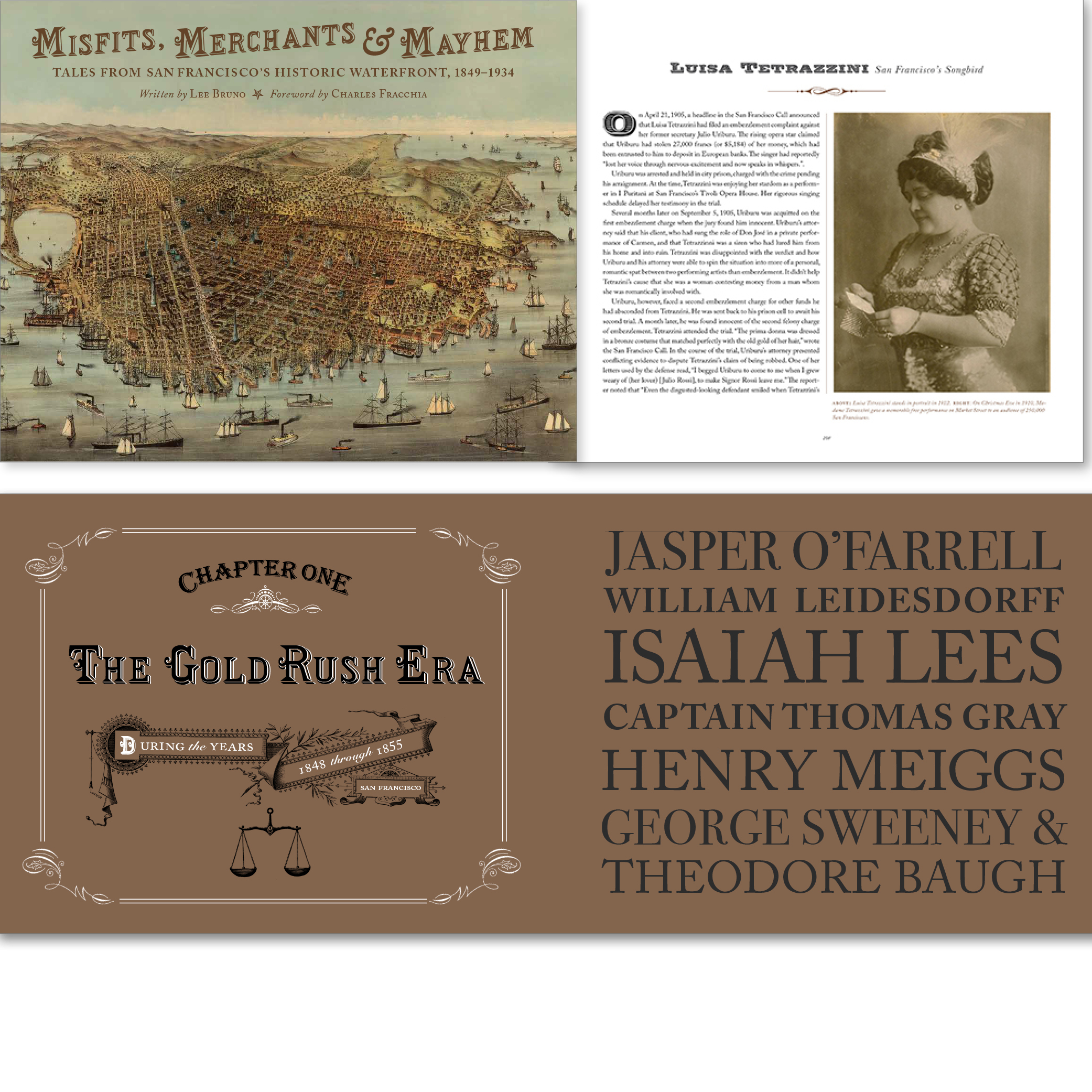
MISFITS, MERCHANTS, AND MAYHEM
MISFITS, MERCHANTS, AND MAYHEM
Design
Designed the entire book from cover-to-cover. Edited photography. Worked with editorial team to maintain historical accuracy of images and art.
160 pages. March. 2018
[ Cameron+Company ]
-
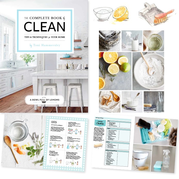
CLEAN
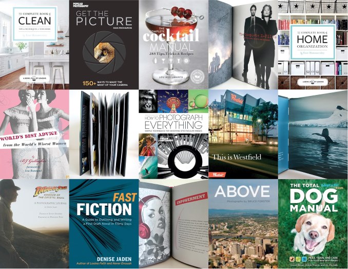
THE COMPLETE BOOK OF CLEAN
Art Director
Concepted look and design, from cover-to-cover, including art directing a photoshoot of cleaning recipes with photographer Aubrie Pick, and stylist Ethel Brennan. Worked directly with author and met with editorial team weekly to present ideas and work on edits.
240 pgs. Jan. 2017
[ WELDON OWEN ]
-
COCKTAIL MANUAL
THE COMPLETE COCKTAIL MANUAL
Designed the book pages cover-to-cover with a unique layout for every page. Art directed illustrators to create illustration for processes, glasses and specific drinks. Worked as photo-editor to source photographs and work with photographers to select photographs for the book. Worked with editorial team weekly to present ideas and work on edits.
260 pgs. Oct. 2016
[ WELDON OWEN ]

-
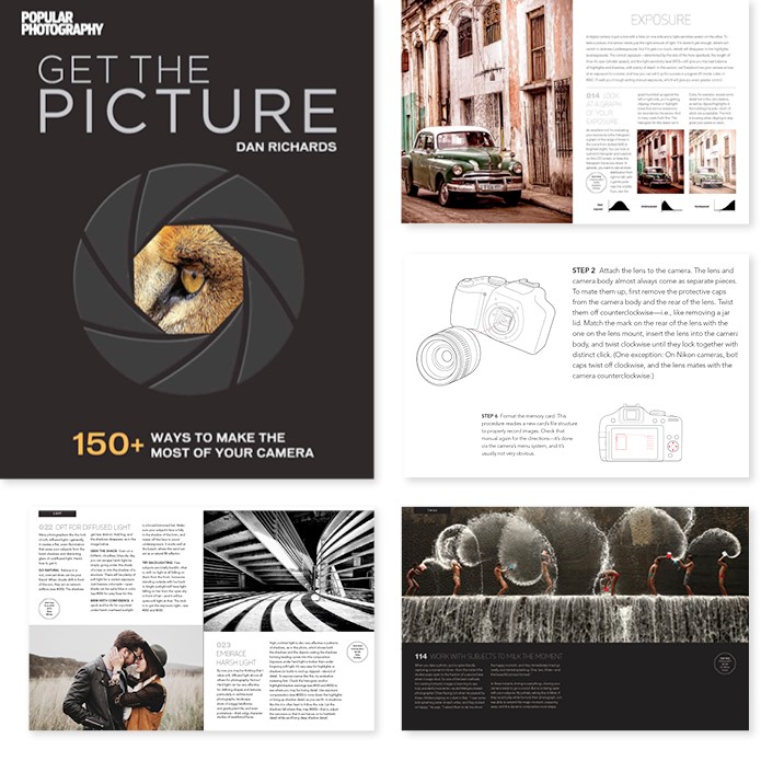
GET THE PICTURE
GET THE PICTURE
Art Director
Concepted look and designed book cover-to-cover. Art directed illustrators to create illustrations. Worked as photo-editor to source and select photographs to illustrate the 220-page book. Worked with editorial team weekly to present ideas and work on edits.
240 pgs. Aug. 2016
[ WELDON OWEN ]
-
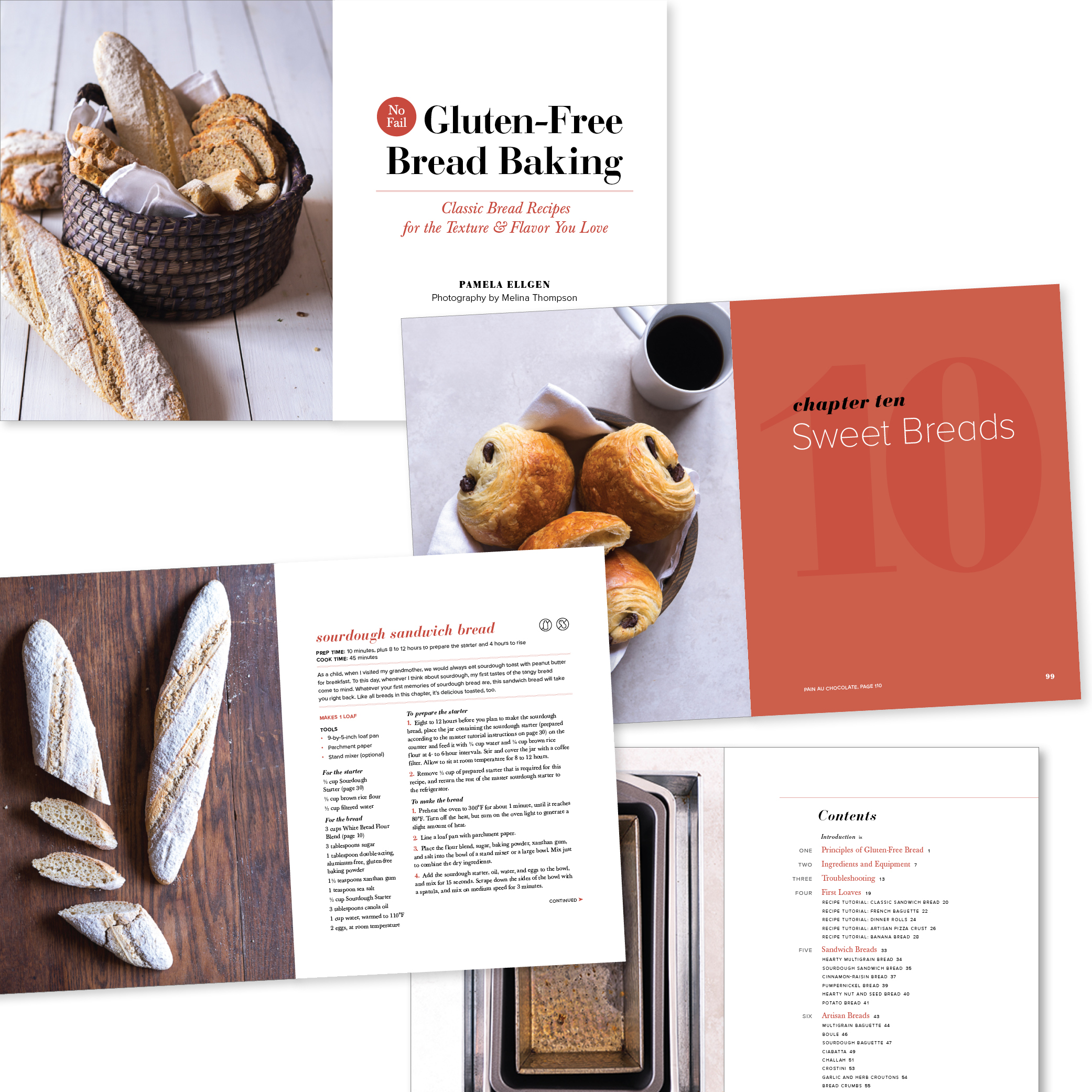
Gluten-Free Bread Baking
Gluten-Free Bread Baking
Designer
Designed the book's interior pages to have classic, warm and inviting typography for the recipes and photos of the author, Pamela Ellgen's gluten-free creations.
[ Callisto Media ]
-
HOME ORGANIZATION
THE COMPLETE BOOK OF HOME ORGANIZATION
Concepted look and designed book cover-to-cover. Concepted illustration style and art directed two illustrators to create illustrations for specific tips. Worked as photo-editor to select photographs to illustrate the 220-page book. Worked with editorial team weekly to present ideas and work on edits. Book has remained on Amazon's Best Seller list since 2015.
208 pgs. Jan. 2016
[ WELDON OWEN ]

-
HOW TO PHOTOGRAPH EVERYTHING
HOW TO PHOTOGRAPH EVERYTHING
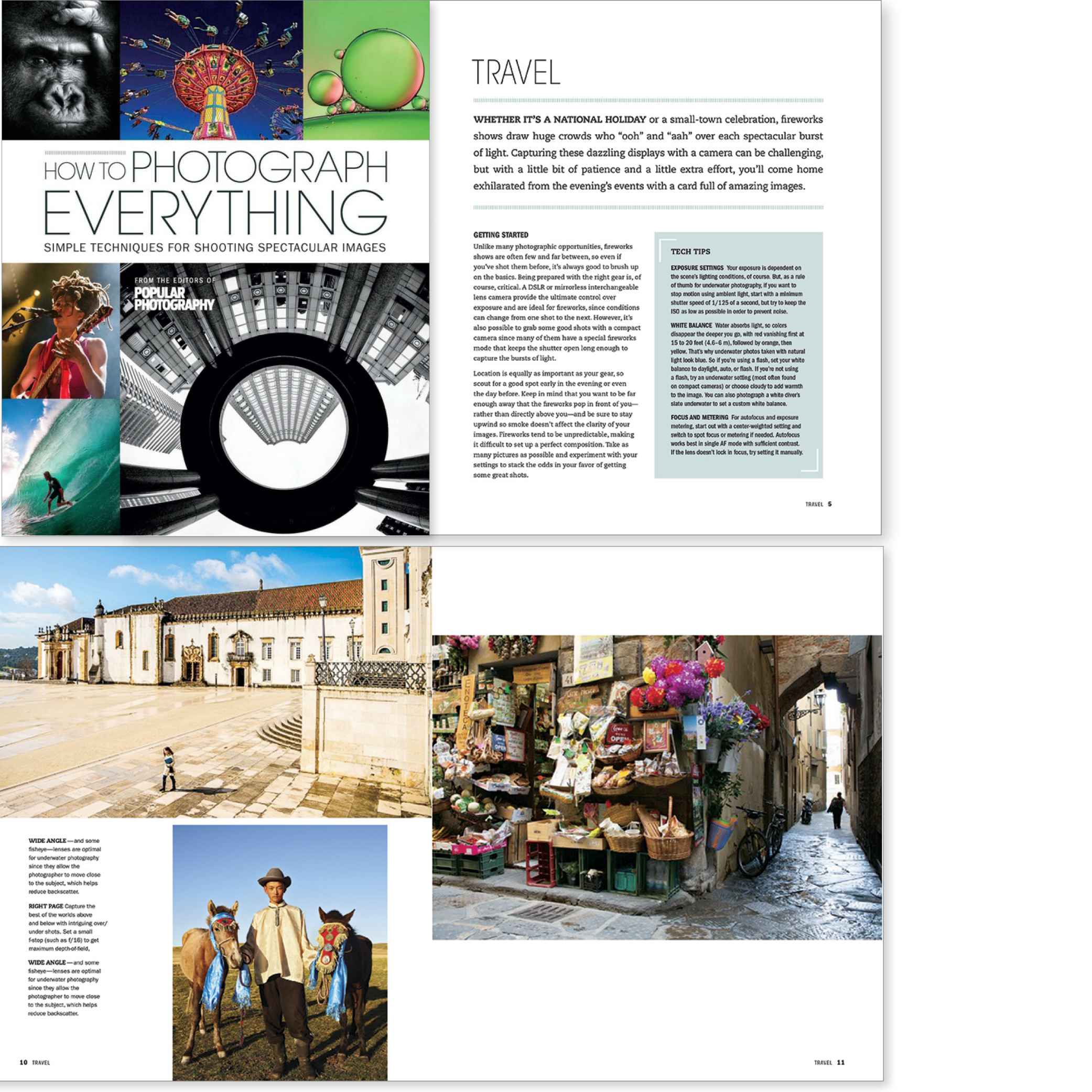
Designed and worked as photo-editor to select over 500 photographs that illustrate the 320-page book. Worked with editorial team weekly to present ideas and work on edits.
320 pgs. Nov. 2014
[ WELDON OWEN ]
-
THE POTRERO VIEW
THE POTRERO VIEW
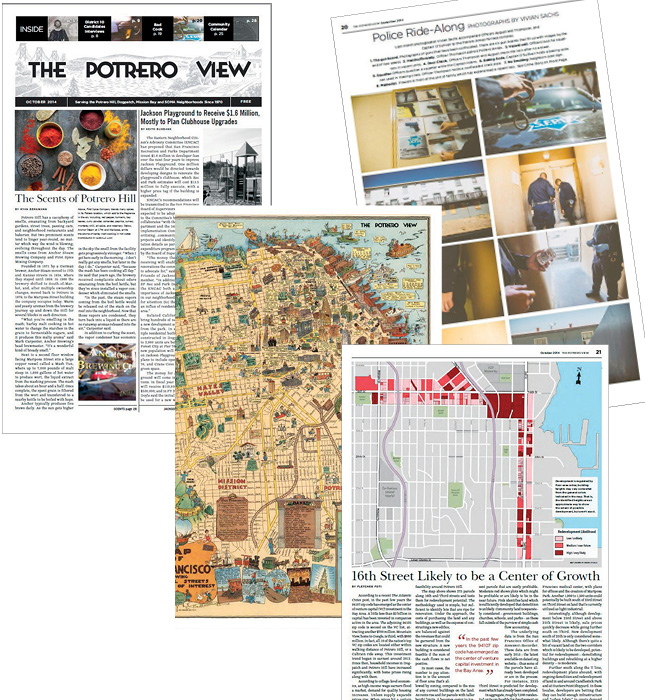
Developed visual content and designed 24-to 40-page monthly tabloid. Sourced and art directed illustrators and photographers to illustrate articles, opinion pages, fiction, and poems. Photographed stories. Developed photo essays. Managed printing.
-
ABOVE PORTLAND
ABOVE PORTLAND
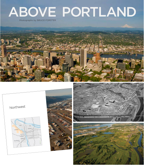
Rebranded the entire Above series to have a fresh modern yet classic look with the design of the newest edition, Above Portland. Edited and ordered hundreds of photographs to create a beautiful flow to these images. Worked closely with the photographer, writer and publisher to make the presentation of the book cohesive and as easy to follow as a map. Through the stunning aerial photography of Bruce Forster, Above Portland offers a unique and beautiful perspective on the picturesque region of Portland, Oregon and its surrounding areas.
144 pgs. Nov. 2010
[ CAMERON+COMPANY ]
-
SAFE IN THE ARMS
SAFE IN THE ARMS OF LOVE
Designed this book cover-to-cover to feel warm, friendly and elegant for its subject matter: bonding with baby. Selected the illustrator Anne Kristin Hagesaether for her painterly style. Mixed black and white photography for inside pages with soft colors.
80 pgs. Apr. 2011
[ WISE PARENTING PRESS ]

-
X-FILES
THE COMPLETE X-FILES
Designed this book cover-to-cover for Palace Press. Worked with editor Lisa Fitzpatrick. Edited, cropped, and sequenced over 1,000 images from FOX by episode. Designed spot-gloss “hidden” art based on images from series through out book.
248 pgs.
[ PALACE PRESS ]

-
INDIANA JONES
INDIANA JONES AND THE KINGDOM OF THE CRYSTAL SKULL: A PHOTOGRAPHIC JOURNAL
Designed book cover-to-cover for Palace Press. Showcase of photographer David James' work, Lucas Film wanted book to feel like a gallery. Edited, cropped, and sequenced over 1,000 images from Lucas Film.
192 pgs.
[ PALACE PRESS ]

-
ANTARCTICA
ANTARCTICA: A CALL TO ACTION
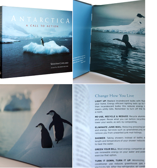
Worked in tandem to design this mini coffee table book for master photographer, Sebastian Copeland who issues a global clarion call in his latest book Antarctica: A Call to Action. Copeland's awe-inspiring images of the frozen continent capture the beauty of the glaciers, biodiversity, and wild wide seas of the Drake.
96 pgs.
[ PALACE PRESS ]
-
WISE WOMEN
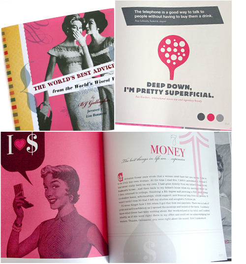
WISE WOMEN: WORLD'S BEST ADVICE
Designed this two-color coffee-table book (7x7") of quotations for and by women by author BJ Gallagher. Found or created, on a shoe-string budget, all the photographs and illustrations.
112 pgs.
[ PALACE PRESS ]
BOOK COVERS
-
FROM SUFFERING TO PEACE
FROM SUFFERING TO PEACE
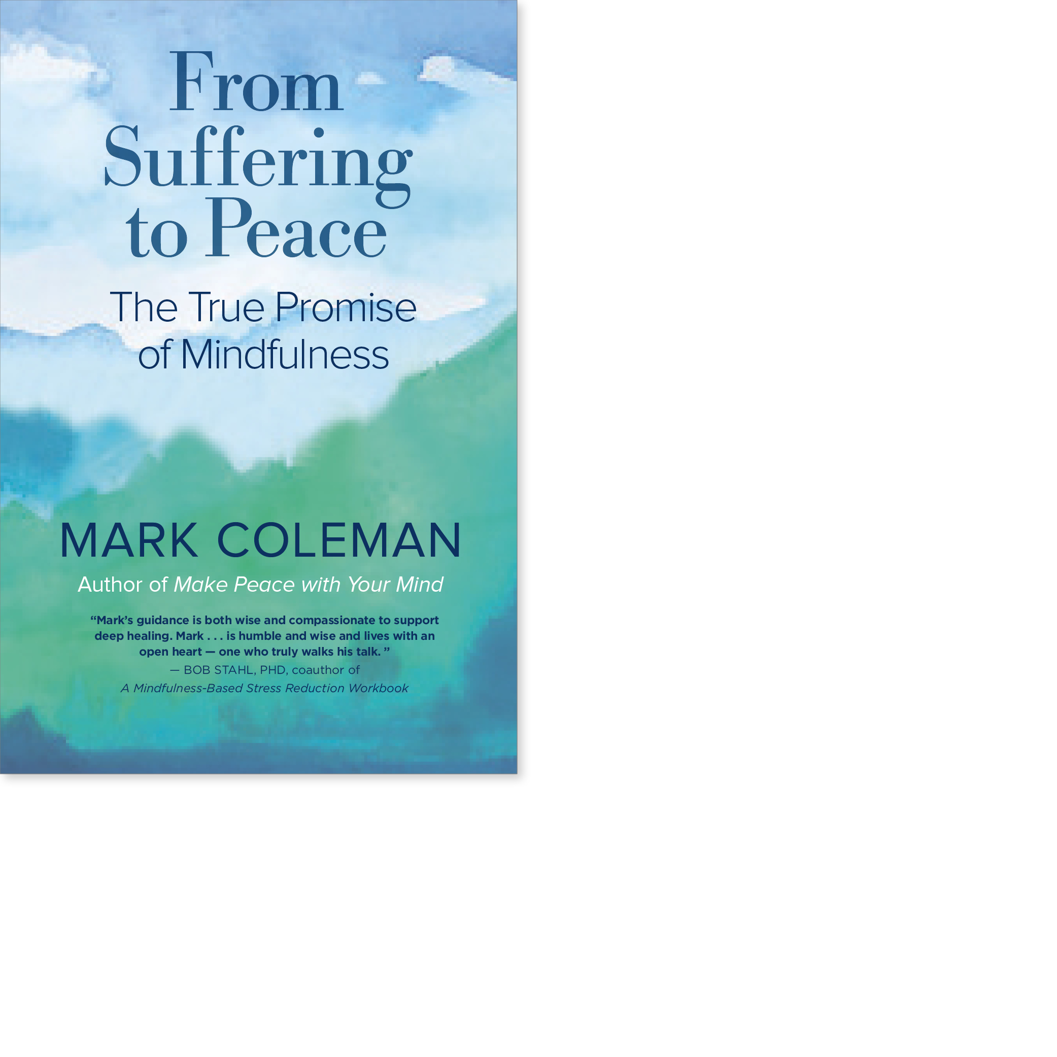
Designed cover for mindfulness book by Mark Coleman to feel peaceful and serene.
May 2019
[ New World Library ]
-
STORY SPARKS
-
BENEATH THE SURFACE
BENEATH THE SURFACE
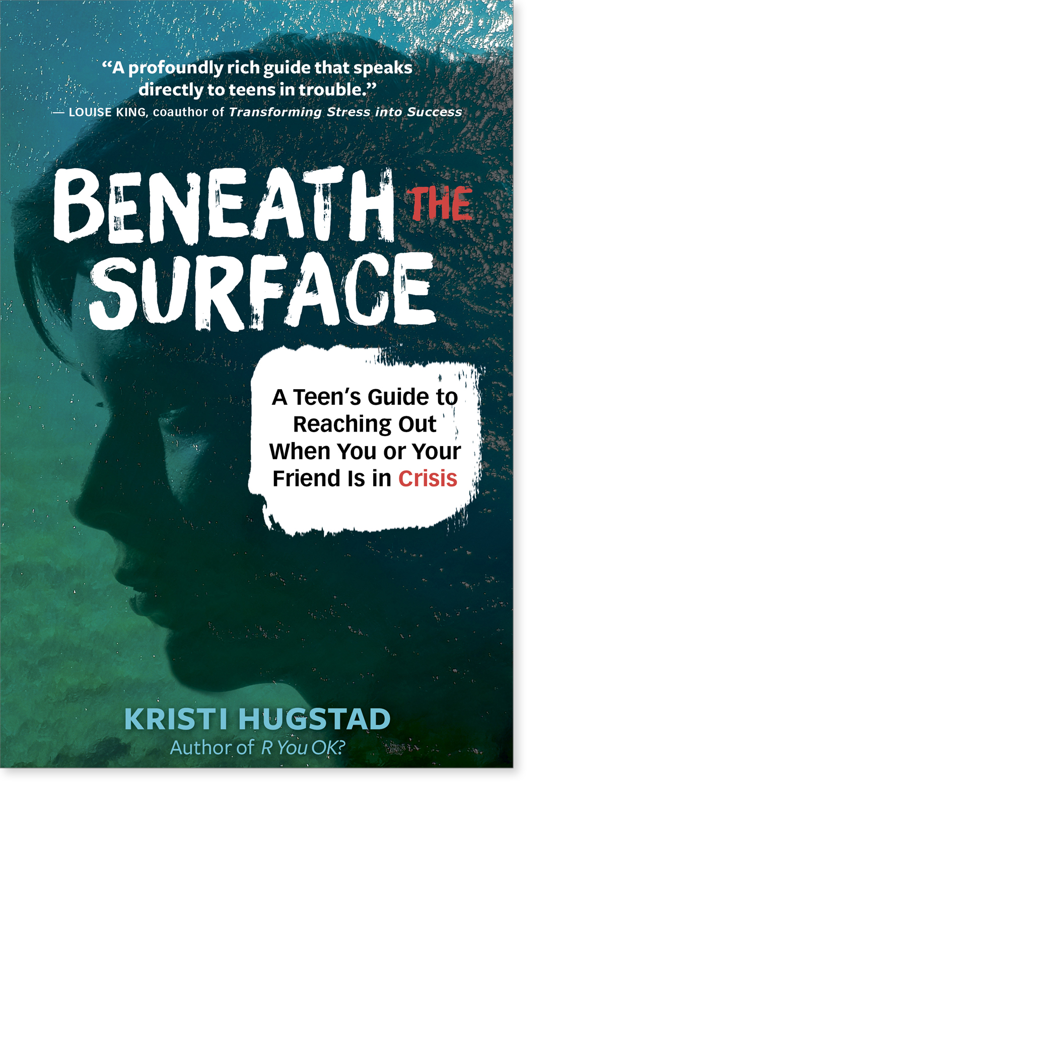
Cover study for book about teens in crisis.
Sep. 2019
[ New World Library ]
-
LOVE, ANIMALS AND MIRACLES

-
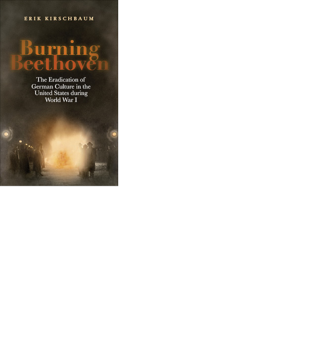
BURNING BEETHOVEN
BURNING BEETHOVEN
Cover design for German publisher.
Jun. 2015
[ Berlinica Publishing LLC ]
-
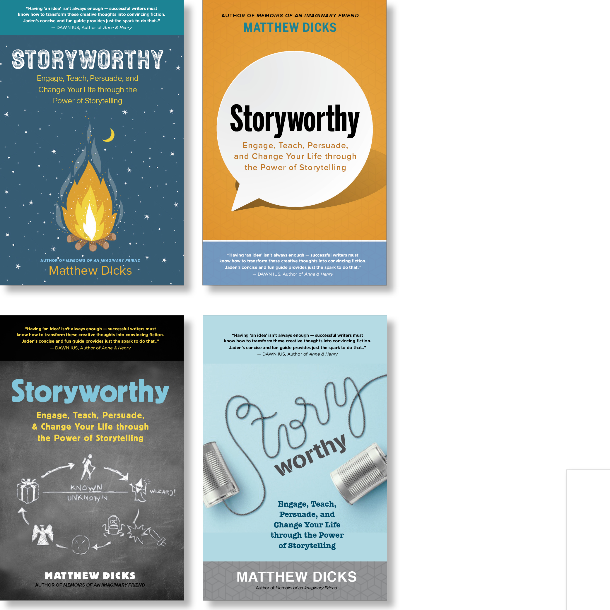
STORYWORTHY
-
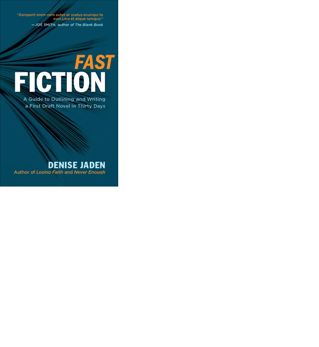
FAST FICTION
-
SOULSPACE
SOULSPACE
Designed this warm and spacious cover for SoulSpace by interior designer Xorin Balbes. Xorin Balbes created his eight-stage SoulSpace process to help his clients create homes that reflect and celebrate what is essential about their inhabitants. Sourced photograph to be used as an illustration.
Release Sep. 2011
[ NEW WORLD LIBRARY ]

-
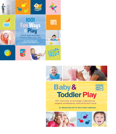
FUN WAYS TO PLAY
FUN WAYS TO PLAY
Re-designed the covers for these two popular, classic companion books sold by Gymboree. Sourced the photographers to create images for the cover.
Jan. 2012
[ WELDON OWEN ]
-
SUPERSTITION
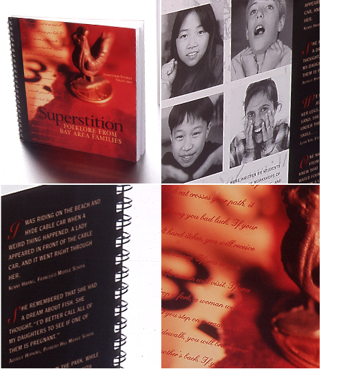
STREETSIDE STORIES: SUPERSTITION
Photo-Illustration / Design / Photography
Worked with non-profit organization to design their yearly anthology of children's stories for five years. Photographed kids to put on the covers. The book was always a big hit for these middle school kids.
[ STREETSIDE STORIES ]
MARKETING
-
EXPLORATORIUM
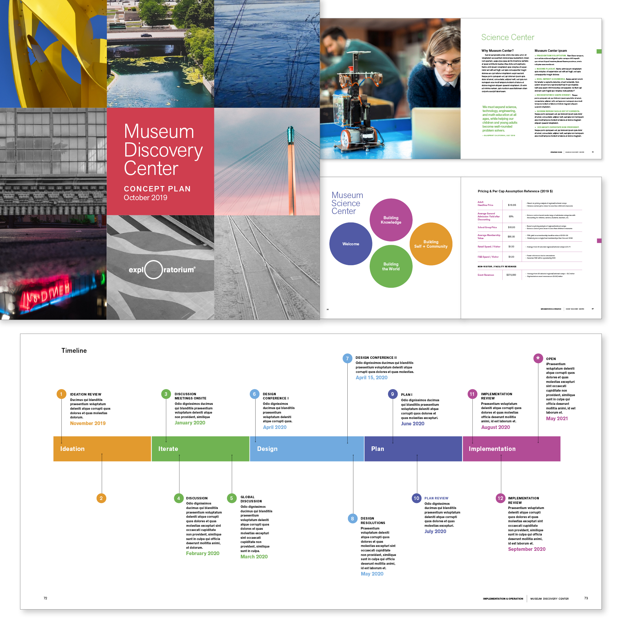
EXPLORATORIUM
Art Director
Worked directly with Curatorial Strategist. Designed a strategic presentation showcasing museum's vision. Sourced images to illustrate the content. Created charts and graphs. 76-pages, 3 formats: eBook, Google Slides, and printed book.
-
BARBCO REBRANDING
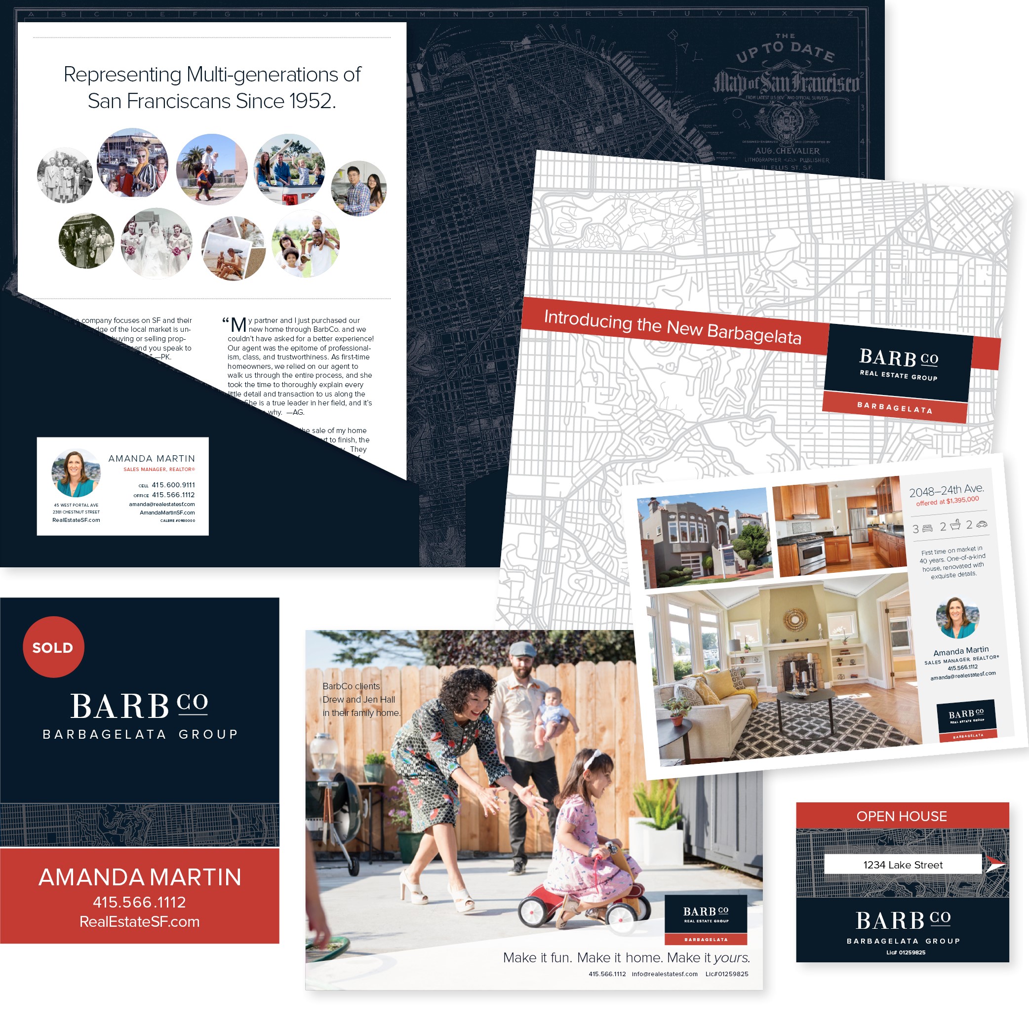
BARBCO REBRANDING
Art Director
Worked directly with CEO to develop new branding which maintains their 66 years of brand equity while appealing to younger clients in a modern, genuine and friendly way. Rebranded and redesigned: logo, whole signage system, social media campaigns, marketing collateral, billboards, business cards, letterhead, HTML emails, newspaper and billboard ads, and managed all the printing.
[ BARBCO ]
-
BARBCO MINI-BROCHURE
BARBCO MINI-BROCHURE
Designed a simple and powerful message for a New Client Brochure with client stories and showcased homes, while providing valuable data needed to navigate in a highly competitive market.

-
BLURB TEMPLATES
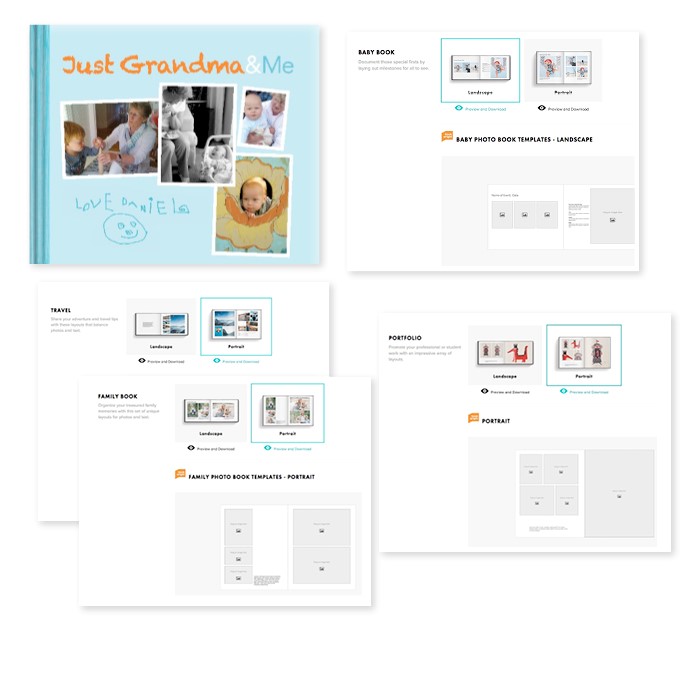
BLURB TEMPLATES
Designed a series of book templates for photo books on offer at the self-publishing book website, Blurb. Created 15 different page combinations for each 80-page book, with variations depending on use of the book, Baby Book, Family Book, Travel Book or Portfolio. Worked with Product Director.
[ BLURB ]
-
SYLVAN LEARNING
SYLVAN SERVICES
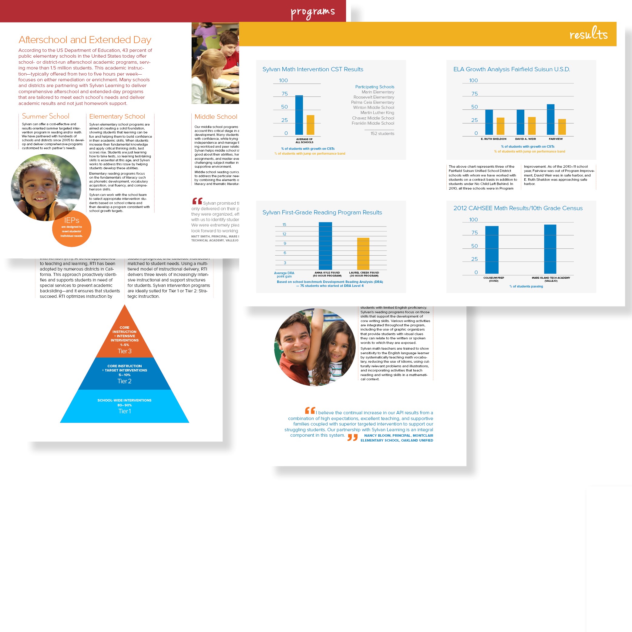
Worked closely with Sylvan Learning team to distill the vast amount of statistical data and program information in a way that was clear for the parents looking to help their struggling child. Designed 20-page booklet and created infographics.
20 pgs.
[ SYLVAN LEARNING EAST BAY ]
-
FRIENDS OF JACKSON PARK
FRIENDS OF JACKSON PARK
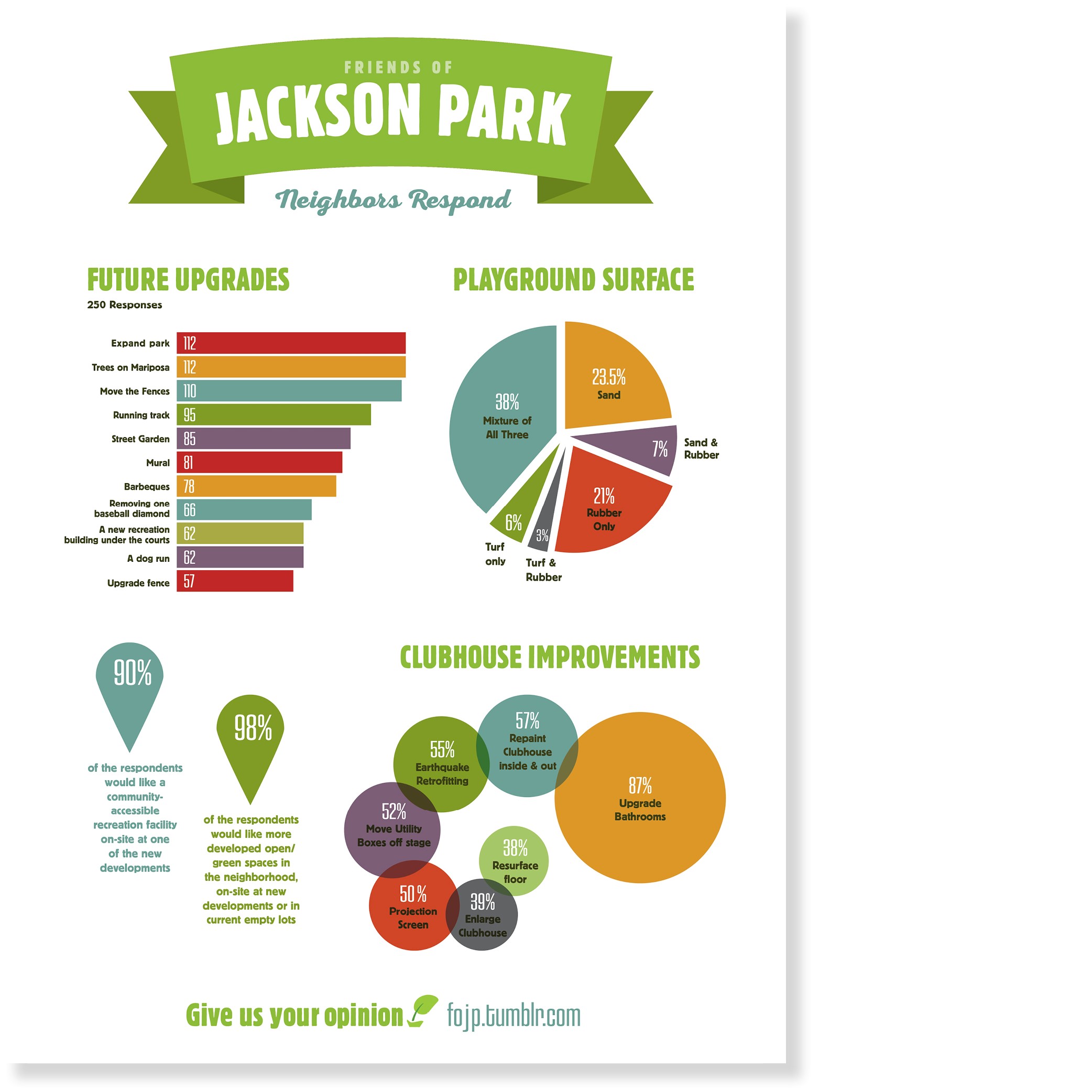
Worked with volunteer organization, Friends of Jackson Park to design infographics in order to communicate how neighbors would like to see the park upgraded.
Volunteer [ FRIENDS OF JACKSON PARK ]
-
THIS IS WESTFIELD
THIS IS WESTFIELD
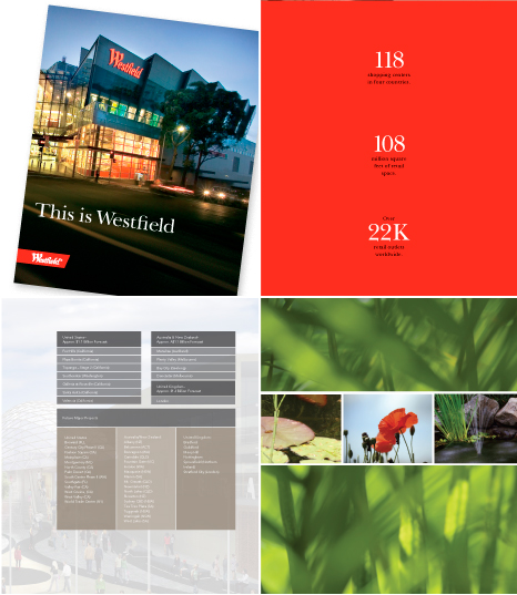
Designed this book cover-to-cover for Westfield Marketing. Tool to introduce the Westfield brand to new employees, vendors and investors. Used graphs, maps, statistics as art elements. Sourced 50% of images and selected from Westfield image archive.
44 pgs.
[ WESTFIELD ]
-
WOW WORKBOOK
WOW WORKBOOK
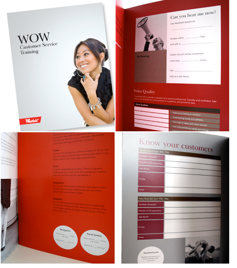
Designed this training workbook, a tool to inspire and teach new employees. Needed to feel fun yet also professional. Worked closely with Westfield's National Training Director to make sure every detail met the specific content needs of the training workshop.
44 pgs.
[ WESTFIELD ]
PACKAGING
-
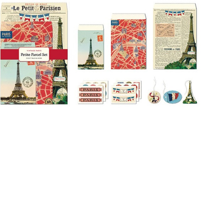
PETITE PARCEL SET
PETITE PARCEL SET
Worked with team to select vintage emphera from vast collection in order to create unique combinations of new artwork. Worked in photoshop to create collages. Designed packaging. Photographed product.
[ CAVALLINI ]
-
FOLDERS
FOLDERS
Worked with team to select vintage emphera from vast collection in order to create unique combinations of new artwork. Worked in photoshop to create collages. Designed packaging. Photographed product.
[ CAVALLINI ]

-
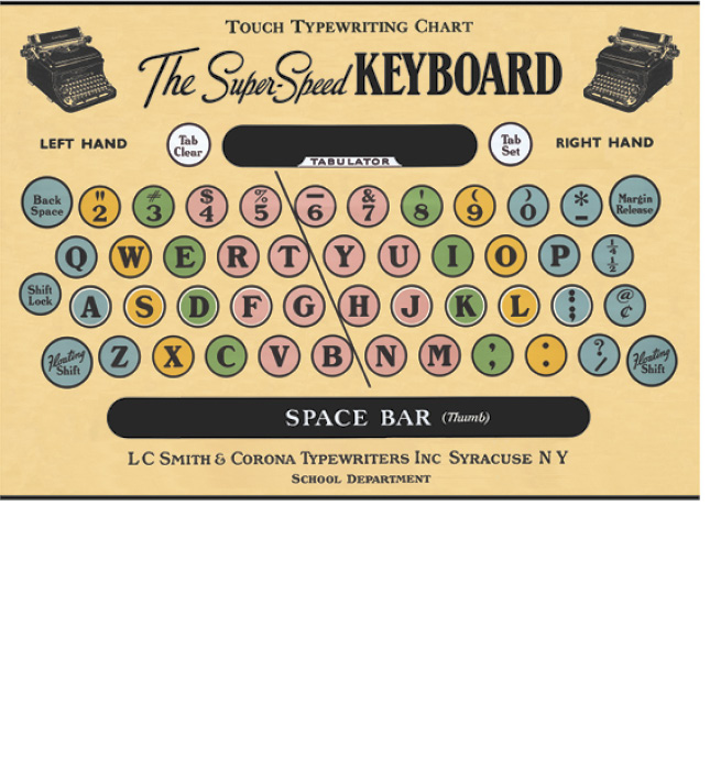
WRAP
WRAP
Worked with team to select vintage emphera from vast collection in order to create unique combinations of new artwork. Worked in photoshop to create collages. Designed packaging. Photographed product.
[ CAVALLINI ]
-
GAP G
G - FRAGRANCE FOR MEN
Design-directed the packaging design for new men's fragrance. The fragrance smelled like a t-shirt worn against skin. My idea: let the box design feel like a t-shirt. Soft to the touch, the box is blind-debossed on uncoated paper.
Communication Arts Design Award

-
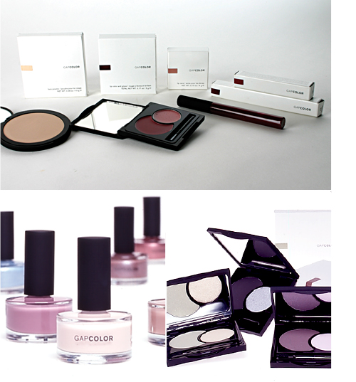
GAPCOLOR
GAPCOLOR
Design-directed the whole new look of Gap's cosmetic line to have sleek, black components; clean, white packaging; and a signature crescent shape for the eye and lip product. Innovation: Color sticker on the front of the box added design element while revealing the color of the product inside.
AIGA Award for Packaging
-
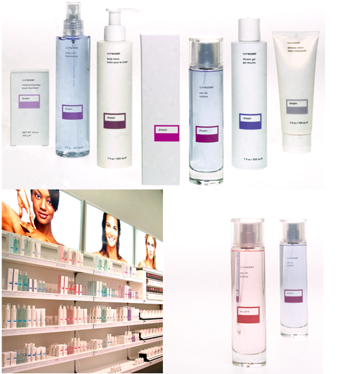
GAPSCENT
GAPSCENT
Art directed redesign of the fragrance line and fixture presentation. The goal was to create an entire product line that would be sophisticated yet hip, with Gap's minimalist aesthetic. The innovation: The EDT box was designed with two front faces: one side white, the other with color to give merchandising an easy way to add color to the presentation.
-
GAPCOLOR COSMETICS
GAPCOLOR COSMETICS
Every season a new item was introduced as a “seasonal” must-have. Worked with vendors to select components to give new life to the collection. Hundreds of new products were created every year.

-
GAP MEN'S
GAP MEN'S UNDERWEAR SYSTEM
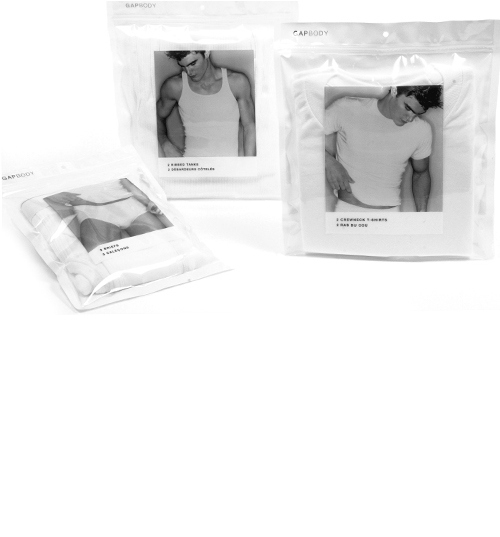
Designed new packaging system for Men's Underwear hanging wall presentation. System had to look good as a unit (clean + simple), be easy to shop (product + size in plain view), and work for underwear (hermetically sealed). Art directed photoshoot for men's underwear with Pablo Alfaro.
-
GAPBODY VALENTINE'S
GAPBODY VALENTINE GIFTSET
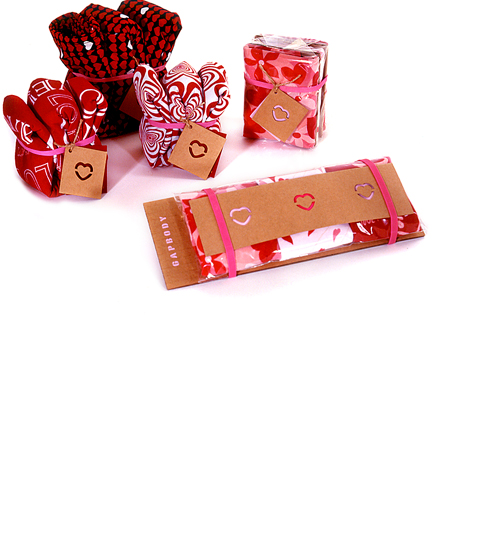
Merchant group was looking for a new way to package the seasonal valentine gift underwear and pajamas. Designed to feel like a hand-made card, this innovative and fun solution from kraft paper had built-in cards and was a huge hit.
-
GAP 1969
GAP 1969 JEANS HANGTAG
Every season the merchants needed a fresh approach to the hangtag system for the season's hippest jeans but always at a low cost. This tag system was designed on kraft paper in two parts with grommet to look cool, but also made it easy put the various fit styles with all the wash styles together affordably.

-
GAP BAGS
GAP CITY & TRAVEL BAGS
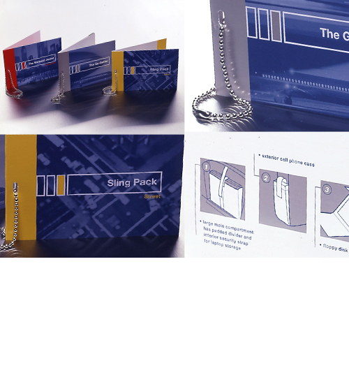
Gap needed a facelift to their hangtag system. Art directed the idea to use illustrations inside to let consumer understand how technical the bags were, and at the same time created a beautiful system to mirror the design and style of the bag.
-
NEWBORN GIFTSETS
BABYGAP NEWBORN GIFTSETS
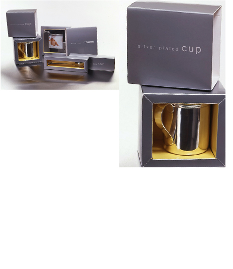
Art directed the packaging idea for simple, affordable yet beautiful packaging, ready to give as gift.
-
NATURE'S CURE
NATURE'S CURE
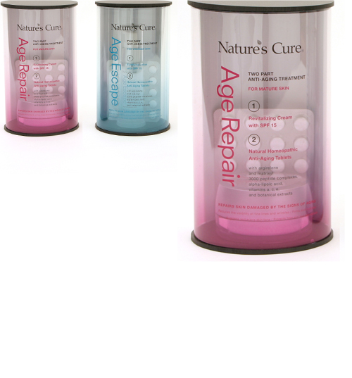
Art directed and designed a packaging system for this mass-market company. The idea was to make the product look as beautiful as the high-end brands but allow the mass customer to buy this product off the shelf. Innovation: Clear packaging with minimalist design made it stand out on an otherwise colorful and cluttered shelf.
-
ECO KID KIT
ECO KID KIT
Designed the entire product package for a Starbucks kit for kids using recycled papers, reusable pieces and eco-friendly inks. Art directed illustrator Lisa Adams who created the color, cover drawings. Kit includes two booklets, How-to-Go-Eco cards, a coloring book, crayons and box.
[ INSIGHT EDITIONS ]

MUSIC + ART
-
SAFE IN THE ARMS
SAFE IN THE ARMS
Worked closely with musician and author, Lisa Rafel to design Safe in the Arms of Love, CD and Book Set. Selected the Norwegian illustrator Anne Kristin Hagesaether for her painterly style. Sourced photography.
Apr. 2011
[ LISA RAFEL, WISE PARENTING PRESS ]

-
VARIOUS ARTISTS
VARIOUS ARTISTS
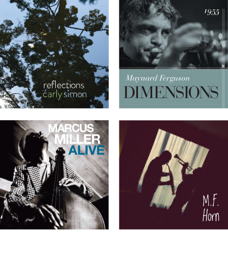
CD Cover designs proposed for various artists.
[ PROPOSED ]
ART DIRECTION
-
THE LONNY HOME
THE LONNY HOME
Photo Art Director
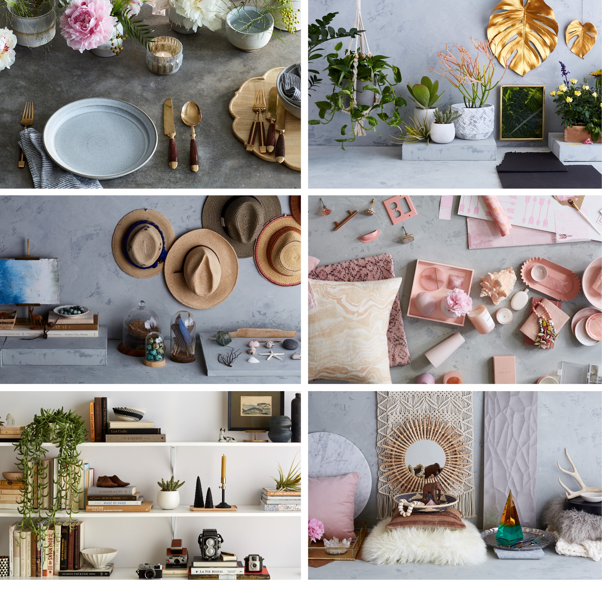
Created mood boards with potential prop ideas, as well as sourced actual props. Created rough compositions for each shot. Spent three days on set to provide art direction for photographer Naomi McColloch and stylist Bryson Gill.
304 pgs. Nov. 2018
[ WELDON OWEN ]
-
THE COMPLETE BOOK OF CLEAN
THE COMPLETE BOOK OF CLEAN
Photography Art Director
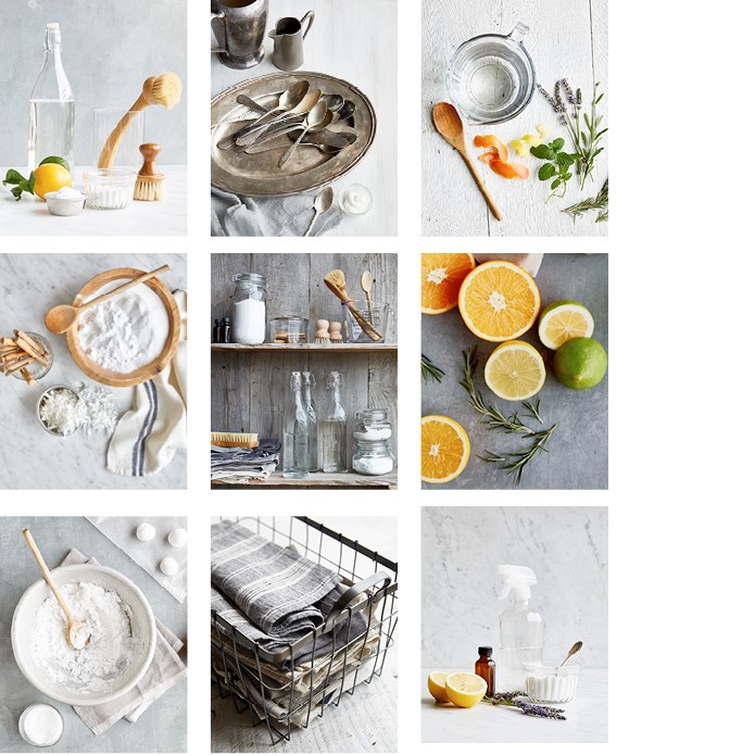
Concepted the look of the photography for cleaning recipes in order to feel fresh with natural light, and have a modern farmhouse feel�rustic and fresh. Worked with stylist, Ethel Brennan on set, and photographer Aubrie Pick. The challenge was to make baking soda, borax and vinegar look visually interesting and appealing. Concepted photography shot list from inspiration, selected props.
-
YOGA JOURNAL MOM & BABY
YOGA JOURNAL MOM & BABY
Art directed photoshoot on location for article about “Mom & Baby Yoga”.

-
GAPBODY SPRING
GAPBODY SPRING
Art directed photographer Pablo Alfaro in order to create a new feeling for GapBody imagery: it's okay to be sexy. Worked closely with Alfaro to select models, create style and produce movement in images. Best part was always coming home with a stack of great polaroids. Worked at Smashbox in Los Angeles.

-
GAPBODY SUMMER
GAPBODY SUMMER
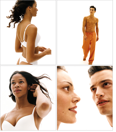
Art directed Christian Witkin to create a different sort of image campaign for GapBody that would feel clean and hip, and a bit heroic to blend well with the other Gap brands' imagery. Cast models. Worked at Chelsea Studios in New York.
-
GAPBODY FALL
GAPBODY FALL
Notorious as a clean and pure brand, this GapBody campaign introduced some interaction between the sexes. Steam! Art directed Lorenzo Algius to create a feeling of gentle sensuality. Cast models. Worked on location in Los Angeles.

-
GAPBODY ICONIC
GAPBODY ICONIC
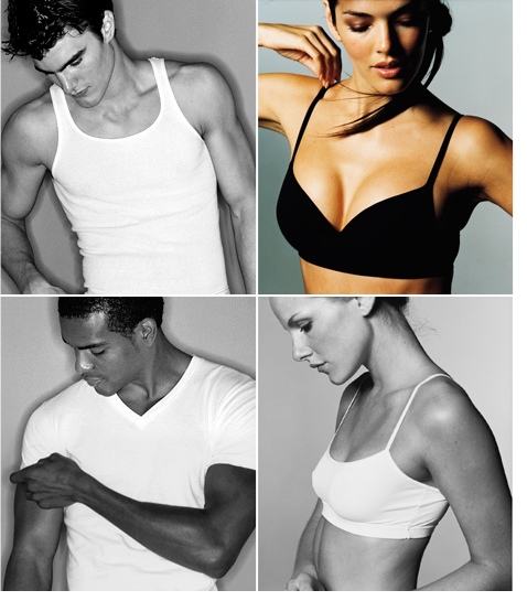
Art directed Pablo Alfaro to create many GapBody images for men and women — for packaging and menu boards to elegantly show product. Worked closely with Alfaro, developing a great collaboration resulting in a whole new fresh look for GapBody. And yes, there were lots and lots of good looking people in their underwear!
-
New York Blackout of 2003
The image used as my masthead was taken Friday, August 15, 2003. It's a day I'll never forget. Working on assignment for the Gap, I was in elevator with three colleagues when the lights went out and the elevator stopped. Needless to say my heart was in my throat. After about 20 seconds, a back-up generator kicked on. The building was evacuated. We spilled into the street with thousands of others. We walked 50 blocks back to our hotel as subways, taxis and cars were at a standstill. Once we all realized it was not a terrorist attack, it was a great excuse for good cheer: there was lots of laughing, stopping for a cold beer, and of course, walking barefoot.

ABOUT
-
I'm passionate about using design to bring a product to life — books, websites, user experiences, social media campaigns and business services.
I develop the creative strategy, art direction and branding for those products: the logo, packaging, content, marketing collateral, asset style and development, user journey mapping, wireframing, and user research.
I'm a creative, design thinker and agile project manager who's flexible, iterative and organized. I collaborate with and coordinate teams of writers, editors, project managers, leadership teams, printers, photographers, illustrators, and web developers.
I'd be delighted to speak with you about your project and see what we can create together.
TESTIMONIALS
-
“I've had the pleasure of working on a very detailed and involved project for over six months with Jennifer. She brings not only incredible graphic design skills and knowledge but also becomes part of your team, and is dedicated to making sure the project is done right! What started as a brief marketing campaign ended up becoming a entire rebrand of my company. If you love marketing like I do and want a smart, creative collaborative person on your team, I highly recommend Jennifer Durrant Design.” Paul Barbagelata, Owner BarbCo Real Estate Group
“Jennifer is a delight and a talent to work with. She is flexible, creative, takes direction very well—yet always has her own perspective and offers a unique and strong sense of design to every project. I would confidently recommend her to anyone looking for a freelance art director/designer who will be both a team player and an experienced advocate for the best design choices for any project.” Lorraine Rath, Art Director Weldon Owen
“Jennifer is a talented, hard-working art director who I worked with on The Complete Book of Clean. Not only did she put together a beautiful book, she also art directed a visually impactful photoshoot, brought constant ideas to the table while working on the design, managed complex art approvals with the author, and was always willing to put in as much work as needed to make the end product the best it could be. I highly recommend working with Jennifer and hope to again soon in the future.” Allister Fein, Art Director, Weldon Owen
“Jennifer took seriously the challenge of re-branding our successful Above book series with our latest book, Above Portland. She created a design that is sophisticated yet accessible, modern but somehow classic at the same time. Jennifer was a true pleasure to work with, never overbearing and always on top of the task at hand. I hope to work with her on many more books to come.” Chris Gruener, Publisher, Cameron+Company
“Jennifer juggles moving design briefs, odd clients, deadlines, color, content, typographical niceties. She does an extraordinary act. Did I mention she's talented and easy to work with? Oh, and extremely delightful. Check her out.” Iain Morris, VP Creative Director, Cameron + Company
“Jennifer did a fabulous job on our book Safe in the Arms of Love. Her artistic sense and aesthetic sensibility show beautifully throughout the book and we are excited to bring this product to the world. We enjoyed collaborating with her, and we will work with her on our next book.” David Surrenda, Publisher, Wise Parenting Press
“We quit our agency and hired Jenn. Single-handedly, she beautifully designed and produced all of our marketing collateral. We love working with her. She's creative, quick and works with our budget.” Annie Jackson, Marketing Director, Estee Lauder / Rodan and Fields
“We hired Jennifer because we needed fresh thinking for a new line of skincare products targeting a new audience for us. We were impressed by the creativity she brought to the concepts. She presented multiple directions, each of which was unique, impactful, and on-strategy. The designs were finalized in a professional, timely, and cost-effective manner and we're thrilled with the outcome.” Dana Doron, Vice-President Marketing, Nature's Cure
“Every season, we created dozens and dozens of products for four brands. Jennifer brought exhaustive creativity and vision to the product design and packaging of each and every one.” Patti Cazzato, Senior Vice President, Gap
CLIENT LIST
-
- Holloway
- Sköna
- Exploratorium
- BarbCo Real Estate Group
- Ten Speed Press
- Weldon Owen
- Callisto Media
- Cameron + Company
- New World Library
- Blurb
- East West Healing
- Yoga Journal
- McGraw Hill
- Gap
- GapBody
- GapScents
- Golden Gate National Parks Conservancy
CONTACT
LINKS
-
PHOTOGRAPHY BY JENNIFER
VISUAL DESIGN
